Introduction: Why “Top Tools” Matter for Instagram Highlight Design
If you’ve ever landed on someone’s Instagram profile and instantly felt like everything just “fits,” chances are you weren’t consciously analyzing it. You just felt it. The colors, the icons, the layout, it all told a story in seconds. That’s the power of visual branding today. And highlight covers sit right at the center of that first impression. They may look small, almost insignificant, but in reality, they shape how people understand your profile before they even tap on a single story. From what I’ve seen working with creators and brands, the difference between an average profile and a strong one often comes down to design consistency. And consistency doesn’t happen by accident. It comes from using the right tools. Not just tools that “work,” but tools that make the process easier, faster, and more aligned with your brand.
When your visuals look outdated or inconsistent
When your visuals look outdated or inconsistent, people notice, even if they don’t say it. They lose trust quietly. On the other hand, when your design feels clean and intentional, it creates confidence instantly. That’s why choosing the right tools is not just a design decision. It’s a branding decision that directly affects engagement, perception, and even conversions.
- Introduction: Why “Top Tools” Matter for Instagram Highlight Design
- 1. Understanding Instagram Highlight Design in Modern Branding
- 2. Top Tools for Instagram Highlight Covers (Beginner-Friendly)
- 3. Advanced Top Tools for Professional Designers
- 4. Free vs Paid Top Tools Comparison
- 5. How Brands Use Top Tools for Instagram Growth
- 6. Influencer Marketing and Design Tools Connection
- 7. AI and Modern Design Evolution
- 8. Common Mistakes While Using Design Tools
- 9. Future of Top Tools for Instagram Design
- 10. Conclusion
- About Hobo.Video
1. Understanding Instagram Highlight Design in Modern Branding
1.1 Why Highlight Covers Matter
Think of your Instagram highlights as the navigation bar of your profile. Before someone scrolls through your posts, they look at those circles. They try to understand what you offer, what you care about, and whether it’s worth exploring further. Highlight covers act as visual labels for that experience. When they are clear and well-designed, everything feels organized. When they are messy or inconsistent, the entire profile feels confusing.
I’ve seen profiles where the content was actually great, but the highlight section looked random. Different colors, mismatched icons, no clear structure. And it affected how people perceived the brand. On the other hand, when highlight covers are clean and aligned, even simple content feels premium. That’s the subtle power of design. It doesn’t just decorate your profile, it guides the user experience. And the right tools make it much easier to maintain that clarity without spending hours on design every time.
1.2 Rise of Visual Branding
The way people consume content has changed dramatically. Attention spans are shorter, competition is higher, and users are constantly scrolling. In this environment, visuals are no longer optional. They are the primary way people decide what to engage with. More than ever, brands are relying on visual storytelling to communicate quickly and effectively.
I’ve noticed that even small creators are now paying attention to how their profiles look as a whole. Not just individual posts, but the overall feel. And that’s where design tools come in. Without the right tools, maintaining consistency becomes difficult. You end up improvising, which leads to inconsistency over time. But when you have a reliable set of tools, the process becomes smoother. You can focus on creativity instead of struggling with execution. And that shift makes a big difference in how your brand is perceived.
2. Top Tools for Instagram Highlight Covers (Beginner-Friendly)
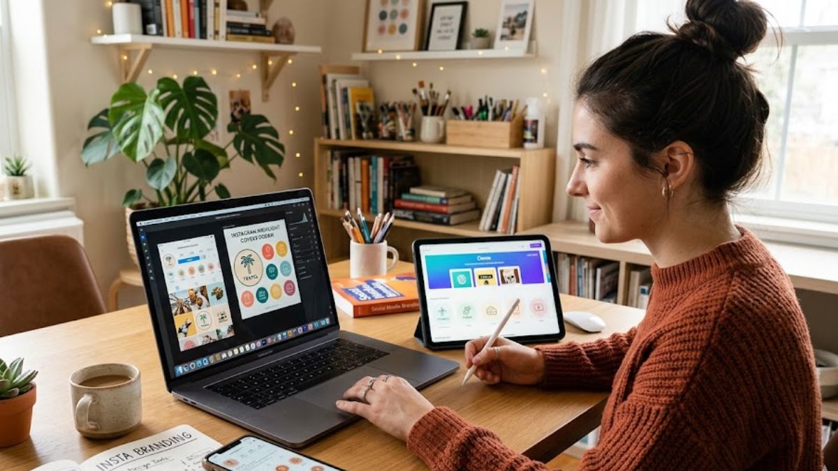
2.1 Canva – The Most Popular Choice
If there’s one tool that has completely changed how people approach design, it’s Canva. I’ve seen complete beginners create professional-looking highlight covers within minutes using it. And the reason is simple. It removes complexity. You don’t need design experience, you don’t need technical knowledge, you just need an idea. The platform takes care of the rest.

Amplify Your Brand,
One Influence at a Time.
What makes Canva stand out is how intuitive it feels. You open it, pick a template, adjust colors, swap icons, and you’re done. But beyond simplicity, it also offers depth. You can create fully customized designs that match your brand perfectly. I’ve worked with teams that use Canva not just for highlights, but for entire content systems. It becomes a central design hub. And for highlight covers specifically, it’s one of the fastest ways to maintain consistency without overthinking every detail.
2.2 Adobe Express – Professional Level Design
Adobe Express sits in an interesting space. It’s more structured than beginner tools, but not as complex as full-scale design software. That balance makes it ideal for creators who want more control without getting overwhelmed. From what I’ve seen, it’s especially useful for maintaining brand consistency across multiple assets, not just highlight covers.
The biggest advantage here is precision. You can align colors, fonts, and layouts in a way that feels intentional. And when you’re building a brand, that level of control matters. I’ve noticed that designers who start with simpler tools often transition to something like Adobe Express once they want to refine their visual identity further. It allows you to move from “good enough” to “polished.” And that difference is visible in how your profile feels to visitors.
2.3 PicsArt – Mobile-Friendly Editing
Not everyone wants to sit on a laptop and design. Many creators prefer working directly from their phones, especially when they’re managing content on the go. That’s where PicsArt becomes incredibly useful. It’s fast, flexible, and built for mobile-first workflows. You can create highlight covers in minutes without switching devices or tools.
I’ve seen creators who rely entirely on mobile apps for their content, and PicsArt fits perfectly into that flow. It allows quick edits, easy layering, and enough customization to create unique designs. While it may not offer the same level of structure as desktop tools, it makes up for it with speed and convenience. And sometimes, that’s exactly what you need. When you’re creating content consistently, having a tool that keeps up with your pace can make all the difference.
3. Advanced Top Tools for Professional Designers
3.1 Figma – Collaboration-Based Design Tool
Once you move beyond basic design and start working in teams or building a serious brand system, tools like Figma completely change how you operate. It’s not just about creating highlight covers anymore, it’s about creating a full visual ecosystem where everything connects. I’ve seen agencies rely on Figma not because it’s trendy, but because it solves a real problem: collaboration. Designers, marketers, and even clients can all work on the same file in real time. That level of visibility removes confusion and speeds up decision-making in a way traditional tools simply can’t match.
What makes Figma powerful is how structured it is. You’re not just designing one icon, you’re building systems. Color palettes, typography rules, reusable components, everything lives in one place. So when you design highlight covers, they automatically align with your overall brand identity. I’ve worked on projects where a small inconsistency in color or spacing created a disconnect across the profile. With Figma, those issues are almost eliminated because everything is connected. It’s not the fastest tool to learn, but once you get comfortable with it, it gives you a level of control and consistency that’s hard to achieve otherwise.
3.2 Adobe Illustrator – Precision Design Control
If there’s one tool that represents complete creative control, it’s Adobe Illustrator. This is where design stops being “good enough” and starts becoming precise. Every line, every curve, every detail can be adjusted exactly the way you want. That’s why professional designers often use Illustrator for creating premium highlight cover sets and full brand identity systems.
From experience, Illustrator is not about speed, it’s about perfection. It takes time to learn, and even more time to master. But the results are worth it. I’ve seen highlight covers created in Illustrator that look incredibly clean and sharp, even when scaled across different devices. That’s the advantage of vector-based design. It doesn’t lose quality, and it gives you complete flexibility. For brands that care deeply about visual identity, this level of precision becomes essential. It’s not just design anymore, it’s craftsmanship.
4. Free vs Paid Top Tools Comparison
4.1 Free Tools
When you’re starting out, free tools are more than enough. In fact, some of them are so good that you can build an entire visual identity without spending anything. Tools like Canva (free version), Pixellab, and Crello give you access to templates, icons, and editing features that cover most basic needs. I’ve seen creators build strong, recognizable profiles using only these tools.
The real advantage of free tools is accessibility. You don’t need to worry about cost, which means you can focus entirely on experimenting and learning. And in the early stages, that’s what matters most. You try different styles, test different colors, and slowly figure out what works for your brand. The limitations do exist, like fewer customization options or restricted assets, but for someone starting out, those limitations can actually be helpful. They keep things simple and prevent overcomplication.
4.2 Paid Tools
As you grow, your needs change. You start looking for more control, more flexibility, and more scalability. That’s where paid tools come in. Platforms like Adobe Creative Suite, Figma Pro, and Canva Pro open up a completely different level of design capability. You get access to premium assets, advanced features, and tools that help maintain consistency across larger projects.
I’ve seen brands make this transition naturally. At first, free tools work fine. But as the brand grows, the need for consistency and efficiency increases. Paid tools help streamline that process. They save time, reduce errors, and make it easier to scale your visual identity across multiple platforms. It’s not about replacing creativity, it’s about supporting it. When your tools work smoothly, you can focus more on ideas and less on execution struggles.
5. How Brands Use Top Tools for Instagram Growth
5.1 Building Strong First Impressions
First impressions on Instagram happen faster than most people realize. Within seconds of landing on a profile, users decide whether to stay or leave. And highlight covers play a huge role in that decision. Brands that use structured design tools to create clean, consistent highlights instantly feel more trustworthy. Everything looks intentional, organized, and professional.
I’ve seen profiles transform completely just by redesigning their highlight covers. Same content, same audience, but a different visual presentation. And the impact is immediate. More profile clicks, longer browsing time, and better overall engagement. It’s a reminder that design is not just about aesthetics. It’s about perception. And perception directly influences behavior.
5.2 Driving Engagement Through Design
Good design doesn’t just attract attention, it guides it. When highlight covers are clear and visually appealing, people are more likely to explore them. That leads to more story views, more interactions, and ultimately stronger engagement. It’s a small change with a compounding effect.
From what I’ve observed, brands that invest in design see better retention as well. Users don’t just visit once, they come back. Because the experience feels consistent and easy to navigate. Highlight covers act like entry points into your content. And when those entry points are well-designed, the entire journey becomes smoother. That’s why tools play such an important role. They help you maintain that quality consistently without starting from scratch every time.
6. Influencer Marketing and Design Tools Connection
Influencers today are not just content creators, they are personal brands. And like any brand, their visual identity matters. Highlight covers have become one of the simplest yet most effective ways for influencers to organize and showcase their work. Whether it’s brand collaborations, UGC videos, or campaign results, everything is neatly categorized and easy to access.
Platforms like Hobo.Video are making this ecosystem even stronger by connecting creators with brands and helping them scale campaigns. But even within this system, design remains a core element. I’ve seen influencers with strong visual consistency attract more collaborations simply because their profiles look more professional. It creates confidence. It signals that they take their work seriously. And in a competitive space, that perception can make a big difference.
7. AI and Modern Design Evolution
The way people design today is changing rapidly, and AI is at the center of that shift. Tasks that once required time and experience can now be done in minutes. Tools can suggest color palettes based on your brand, generate icons automatically, and even recommend layouts that fit your content style. For beginners, this is a huge advantage. It lowers the barrier to entry and makes professional design more accessible than ever.
But from what I’ve seen, AI works best as a starting point, not the final solution. It can generate ideas, speed up workflows, and remove technical barriers. But the human element still matters. The final touch, the small adjustments, the decisions that make a design feel unique, those still come from you. The most effective creators are the ones who use AI as a support system, not a replacement. They combine speed with intention. And that’s where real quality comes from.
8. Common Mistakes While Using Design Tools
8.1 Overcomplicating Designs
One of the most common mistakes I see, especially when someone discovers powerful design tools for the first time, is trying to do too much. There’s this temptation to use every feature available. Gradients, shadows, multiple icons, fancy fonts, all packed into one small highlight cover. On the surface, it might feel creative. But in reality, it creates confusion. Highlight covers are tiny. They need to communicate instantly. If someone has to “figure out” what an icon means, the design has already failed.
I’ve worked with creators who spent hours perfecting detailed designs, only to realize that when viewed on a phone screen, everything looked cluttered. The most effective highlight covers I’ve seen are surprisingly simple. A single icon, a clean background, and consistent spacing. That’s it. Simplicity is not a limitation, it’s clarity. And clarity is what makes your profile feel professional. Good design is not about adding more, it’s about knowing what to remove.
8.2 Ignoring Brand Colors
Color might seem like a small detail, but it plays a huge role in how people recognize and remember your brand. When highlight covers use random or inconsistent colors, the entire profile starts to feel disconnected. There’s no visual flow, no identity tying everything together. And even if your content is strong, that inconsistency weakens the overall impression.
From experience, I’ve seen how powerful consistent color usage can be. When all highlights follow a defined palette, the profile instantly looks more organized and intentional. People may not consciously notice the colors, but they feel the difference. It creates familiarity. Over time, that familiarity turns into recognition. And recognition builds trust. Design tools make it easy to save and reuse brand colors, but the real impact comes from using them consistently across everything you create.
8.3 Using Random Icons
Icons are small, but they carry meaning. When they don’t match your brand or don’t follow a consistent style, the message becomes unclear. I’ve seen profiles where one highlight uses a line icon, another uses a filled icon, and another uses a completely different visual style. It creates visual noise. Nothing feels connected.
The best approach I’ve seen is choosing a single style and sticking with it. Whether it’s minimal line icons or bold shapes, consistency is what makes it work. Icons should feel like they belong together. They should also reflect your brand’s personality. A playful brand might use softer shapes, while a premium brand might go for clean, minimal icons. Tools like Canva or Adobe Illustrator make it easy to maintain this consistency, but the decision itself comes from understanding your brand identity first.
9. Future of Top Tools for Instagram Design
9.1 AI-Driven Design Systems
The future of design tools is moving toward automation, but not in a way that replaces creativity. Instead, it enhances it. AI-driven systems are already starting to understand patterns. They can suggest layouts, recommend color combinations, and even generate icons based on your brand style. What used to take hours can now be done in minutes.
I’ve tested some of these emerging features, and the shift is noticeable. Instead of starting from scratch, you start with a strong base. That saves time and reduces decision fatigue. But what’s interesting is that the final outcome still depends on human input. AI can guide, but it doesn’t fully replace taste or judgment. The creators who will benefit the most are the ones who learn how to use AI as a starting point and then refine the output with their own perspective.
9.2 Automated Branding Kits
Another trend that’s becoming more visible is the rise of automated branding kits. Instead of designing each element separately, tools are starting to offer complete systems. You define your colors, fonts, and style once, and the tool generates consistent assets for you. Highlight covers, post templates, story layouts, everything aligned automatically.
From a practical point of view, this is a huge advantage. Especially for small teams or solo creators who don’t have the time to design everything manually. I’ve seen how much time this can save while still maintaining quality. It removes repetition and ensures consistency across all touchpoints. And in branding, consistency is everything. When every visual element feels connected, the entire profile becomes stronger.
9.3 Creator Economy Growth
As the creator economy continues to grow, design tools are becoming more than just creative platforms. They are turning into business tools. Creators are not just posting content anymore, they are building brands, securing partnerships, and monetizing their presence. And visual identity plays a big role in that journey.
I’ve noticed that creators who invest in their design early tend to stand out faster. Their profiles look more professional, their content feels more cohesive, and brands take them more seriously. Tools make this possible without requiring a full design background. They level the playing field. But at the same time, they also raise the standard. Because when everyone has access to good tools, the difference comes down to how well you use them.
10. Conclusion
When you bring everything together, one thing becomes very clear. Design tools are not just about making things look good. They shape how your brand is perceived. The right tools help you stay consistent, save time, and create visuals that actually connect with people. But tools alone are not enough. They need to be used with intention. Simplicity, clarity, and consistency matter more than complexity.
I’ve seen creators transform their profiles just by improving their highlight design. Not by changing everything, but by making smarter choices. Using the right tools, sticking to a clear style, and focusing on what actually works. That’s where the real difference comes from. When design and strategy come together, the results are visible. More engagement, better retention, stronger identity. In the end, tools are just enablers. What really matters is how you use them to tell your story. Because people don’t just see your design, they feel it. And that feeling is what shapes their perception of your brand.
FAQs
What are the best Top Tools for Instagram highlight covers?
Canva, Adobe Express, and Figma are among the best tools for creating highlight covers.
Are free design tools good enough?
Yes, free tools like Canva are enough for beginners and small brands.
Which tool is easiest for beginners?
Canva is the easiest and most beginner-friendly option.
Do highlight covers really affect engagement?
Yes, they improve profile trust and increase engagement rates.
What is a highlight cover maker?
It is a tool used to design icons for Instagram highlight sections.
About Hobo.Video
Hobo.Video is India’s leading AI-powered influencer marketing and UGC company. With over 2.25 million creators, it offers end-to-end campaign management designed for brand growth. The platform combines AI and human strategy for maximum ROI.
Services include:
- Influencer marketing
- UGC content creation
- Celebrity endorsements
- Product feedback and testing
- Marketplace and seller reputation management
- Regional and niche influencer campaigns
Trusted by top brands like Himalaya, Wipro, Symphony, Baidyanath and the Good Glamm Group.
If you’re thinking about brand growth, let’s turn those thoughts into action. Reach out.
The collabs are real. The payouts are real. All that’s missing is you. Let’s go.