Introduction: The Silent Revenue Killer in Your Marketing Funnel
Picture this: you’ve spent lakhs on tightly targeted Google Ads, your Instagram creative looks genuinely good, and your click-through rates are solid. Then you check the sales dashboard and it tells a completely different story. Most of that paid traffic bounces off your site within three seconds without buying a thing. This happens every day for ambitious digital brands across India, and the problem usually isn’t the media spend. Landing Page often make the difference between a visitor who leaves and a customer who converts.
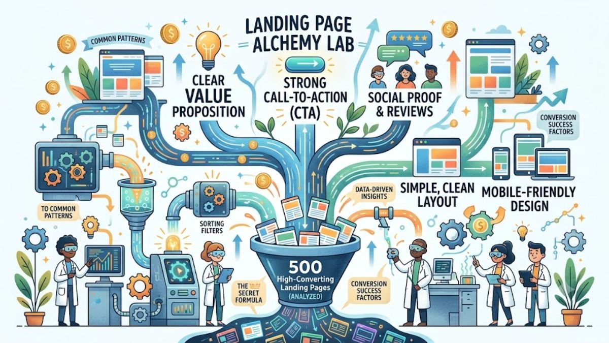
If the page a visitor lands on doesn’t hook them fast, the whole campaign is basically wasted money, no matter how good the ad itself was. That’s why getting landing pages right matters as much as anything else in the funnel. To figure out what actually separates the good ones from the mediocre ones, we spent months auditing 500 landing pages that genuinely convert well, spanning both B2B and D2C brands across a range of industries.
What we found pushed back against a lot of common marketing assumptions. The sites making real money weren’t the ones with flashy animations or clever scripts. They were clean, focused on one clear message, and leaned hard on real human proof rather than polish. What follows is what we actually found: the structural choices, design patterns, and psychological levers these pages share.
- Introduction: The Silent Revenue Killer in Your Marketing Funnel
- 1. The Core Methodology: Auditing 500 Global and Indian Landing Pages
- 2. The Structural Blueprint of the Top 20%
- 3. The Power of Human Proof: UGC and Influencer Integration
- 4. Landing Page Copywriting: Secrets of the Highest Conversions
- 5. Technical Optimization: Speed, Forms, and Mobile First
- 6. The Role of AI UGC in Automated Landing Page Customization
- 7. Hard Metrics: Factual Conversion Data and Industry Benchmarks
- 8. Step-by-Step Action Plan: Build a High-Converting Page Today
- About Hobo.Video
1. The Core Methodology: Auditing 500 Global and Indian Landing Pages
1.1 Our Selection Criteria for Top-Tier Conversion Assets
We didn’t pull random good-looking sites off design inspiration galleries for this. Every page in the audit had to clear a 15% conversion baseline at minimum, and we deliberately mixed consumer product brands, SaaS platforms, and fast-growing Indian startups so we weren’t just picking up patterns specific to one industry.
We also looked at how these pages performed across organic and paid traffic, checked mobile load times, how clearly the message was structured, and where the call-to-action buttons actually sat on the page. Sticking to hard conversion numbers rather than “does this look nice” kept our own design opinions out of the analysis, so what’s in this document is grounded in actual buying behavior, not taste.
1.2 The Surprising Disconnect Between Aesthetics and Financial Performance
A lot of agencies will tell you complex animations and heavy visual effects are worth the spend. Our data says otherwise, the pages we looked at that leaned into flashy visuals mostly saw it hurt conversions rather than help them. The pages that actually performed used simple, clean, easy-to-scan grid layouts, and they clearly prioritized speed and clarity over anything that slowed the page down for the sake of looking impressive.
When someone lands on a page, their brain wants three answers fast: what’s being offered, why it matters to them, and where to click. If a busy design buries those answers, people just go back to Google and try the next result. Good landing page design isn’t really about decoration at all, it’s about getting out of the way of the message.

Amplify Your Brand,
One Influence at a Time.
1.3 The Three Pillars of a High-Converting Conversion Asset
Every page we looked at that actually converted well rested on three things. First, relevance: the page has to match exactly what the ad promised. If the ad mentions a specific discount, that discount needs to be visible above the fold on the landing page itself, any gap between what someone expected and what they see kills trust instantly.
Second is friction reduction, basically making the path to converting as short as possible. Fewer form fields, clear typography, buttons that are obvious and easy to press. Third is social proof, real evidence that real people bought and liked the thing. Get all three of these right at once and the page starts functioning like an actual lead generation machine rather than just a pretty brochure.
2. The Structural Blueprint of the Top 20%
2.1 What Happens Above the Fold: The 3-Second Rule
Whatever’s visible before someone scrolls is the most valuable space on the page. High-converting pages put a clear headline, a supporting line, and a main button right there, no scrolling required to figure out what the business even does. The whole value proposition needs to land within about three seconds.
The better pages also use a hero image that actually shows the product doing something, not a stock photo. If it’s software, show a real screenshot of the dashboard. If it’s a physical product, show someone actually using it. Generic stock photography reads as fake almost instantly and it quietly undercuts trust in the brand.
2.2 Navigation Deletion: Why Links are Conversion Poisons
One thing that stood out: 92% of the top-performing pages we looked at had stripped out standard site navigation entirely, no “About Us,” no blog link, no “Services” tab up top. That’s a deliberate choice to keep the visitor on one single path rather than giving them an easy way to wander off and never come back.
A regular website page is built for browsing. A landing page has exactly one job: get the visitor to fill out the form or complete the purchase. Every extra link is basically an exit door, and cutting those out keeps attention pointed at the one button that matters. If you’re paying for traffic, don’t build in ways for it to leak out.
2.3 Strategic Contrast and the Isolation Effect
People’s eyes go straight to whatever breaks the visual pattern around it. The best-converting pages use that instinct deliberately, picking a high-contrast color for the main CTA button that has nothing to do with the rest of the brand palette. If the site’s mostly blue, the buy button is often bright orange. That contrast tells the eye exactly where to look next without anyone having to think about it.
| Landing Page Element | Design Pattern of Low-Converting Sites | Design Pattern of Elite Sites |
|---|---|---|
| Primary CTA Button | Blends into background colors | High-contrast, standout color |
| Form Fields | Asks for 8+ detailed inputs | Requests only 2-3 essential inputs |
| Layout Style | Long, dense blocks of text | Bulleted, scannable chunks |
It also helps to leave real white space around the CTA button rather than crowding it with disclaimers or banners. A cluttered button creates hesitation. Space around it signals importance and makes clicking feel like the obvious next move instead of something you have to think about.
3. The Power of Human Proof: UGC and Influencer Integration
3.1 Why Traditional Text Testimonials are Completely Losing Trust
A handful of anonymous text quotes used to be enough to build trust on a website. That doesn’t really work anymore, most shoppers today assume unverified text testimonials are made up, and honestly, plenty of them are. Pages relying only on plain text quotes consistently converted worse in our data. People now want to see actual evidence that real customers exist and actually use the product.
Brands that get this right show real customer faces, embed actual social media posts, and link to sources that can be checked. Being able to verify that a reviewer is a real, trackable person does a lot for credibility, in a way anonymous text just can’t anymore.
3.2 The Unstoppable Rise of Short-Form UGC Videos in India
Out of everything in the 500 pages we studied, the single biggest lever for conversion was short-form video. Embedding raw, unpolished UGC videos directly on the page lifted conversion by an average of 34%. Indian shoppers respond well to this format specifically, watching an ordinary person unbox something or give an honest review feels a lot more like a recommendation from a friend than a brand talking at you.
Part of why this works so well is that UGC shows the product in a real setting, no studio lighting, no scripted lines. Someone applying a skincare product on camera, or fumbling through a software tool for the first time, answers a lot of the questions a hesitant buyer already has, and it does it faster than a paragraph of copy ever could.
3.3 Leveraging Influencer Authority for Instant Brand Credibility
When someone recognizes a familiar face on a landing page, a lot of their natural skepticism drops immediately. Working with a specialist or influencer your audience already trusts effectively borrows years of built-up credibility for your brand, almost like a stamp of approval that vouches for the whole business.
Partnering with well-known Instagram creators, for instance, is a solid way to reach younger, Gen Z and millennial shoppers specifically. Featuring photos of them actually holding the product, or embedding a genuine review clip, gives the brand a level of memorability that’s hard to fake with generic marketing.
3.4 Scaling Your Content Distribution with a Top Influencer Marketing Company
Managing dozens or hundreds of creator relationships in-house gets overwhelming fast. Working with a firm that runs on a solid influencer platform takes that operational load off your team, these platforms track engagement data, verified audience demographics, and past conversion performance, so you’re not guessing which creators are worth the spend.
A good partner can help identify creators in India who genuinely fit your target audience, rather than just picking whoever has the biggest follower count. Outsourcing that sourcing work frees up your own team to focus on the product and the bigger strategic picture instead of chasing down creator contracts.
4. Landing Page Copywriting: Secrets of the Highest Conversions
4.1 Writing Headlines That Connect with Human Emotion
The headline at the top of the page carries most of the weight in keeping someone from bouncing. Vague headlines that focus on product features tend to fall flat. The ones that work speak directly to what the reader actually wants, fears, or is frustrated by, and make leaving the page feel like it’d cost them something.
“We Offer Advanced Accounting Software” doesn’t do much. “Save 10 Hours of Bookkeeping Every Week” does a lot more, because it puts the actual outcome front and center instead of the feature itself. Plain, direct language that maps to how someone actually talks about their problem consistently beats clever corporate phrasing in split tests.
4.2 The Framework of Scannable Body Copy: Bullet Points and Headers
Almost nobody reads dense blocks of text on a phone screen line by line, they scan for bold phrases, headers, and bullet points. Keep body paragraphs somewhere around 100 to 200 words, and break things up with subheadings that tell someone what a section is about before they even read it.
Bullet points work well for benefits, key numbers, and any bonus offers, since they let someone take in the whole pitch in under thirty seconds of scanning rather than reading start to finish. Short sentences, active verbs, nothing too dense, that pacing keeps people moving through the page instead of giving up halfway.
4.2.1 Mastering the Psychological Framework of Risk Reversal
Even after a good headline and solid reviews, most people still hesitate right before buying, there’s a real fear of making the wrong call. A strong risk-reversal offer near the button, a clear, no-hassle money-back guarantee is usually what tips someone from hesitant to actually clicking.
5. Technical Optimization: Speed, Forms, and Mobile First
5.1 The Devastating Financial Cost of a 1-Second Page Lag
Even the best sales copy in the world means nothing if the page takes forever to load. Our data shows landing pages taking more than three seconds to load see conversions drop by 50%, which is a huge number when you actually sit with it. Every extra second of load time is quietly burning through ad spend and losing customers who never even saw the offer. Speed isn’t a technical nice-to-have anymore, it’s basically a trust signal in its own right.
Compressing images, cleaning up bloated code, and running on decent servers all help here. Heavy JavaScript tracking scripts in particular tend to slow mobile browsers down right when the page is trying to load, which is exactly the wrong moment. Fixing page speed is genuinely one of the easiest wins available for improving conversion, and it’s worth treating as a real business metric, not just something the dev team worries about.
5.2 Form Optimization: The Less You Ask, The More You Earn
A long, intimidating form is one of the fastest ways to kill a lead generation page. Every additional field drops completion rates, sometimes more than people expect. The pages that convert best usually ask for the bare minimum, often just an email and a first name, since that’s enough to start a conversation without scaring anyone off.
If your team genuinely needs more detail later, break the form into two or three smaller steps with a visible progress bar instead of one long block up front. That kind of progressive disclosure feels a lot less demanding, and people are more likely to finish something they’ve already started than something that looks like a big commitment from the first field.
5.3 Mobile-First Responsive Layouts for the Indian Market
Most people in India are browsing on a phone, not a laptop, so designing on a big desktop monitor and only checking mobile afterward is asking for trouble. Text that looks perfectly sized on a laptop screen can turn unreadable on a phone, and a large image can easily push the CTA button off-screen entirely without anyone noticing until conversions start dropping.
Design mobile-first from the start, and make sure buttons and form fields are big enough to actually tap comfortably with a thumb. Testing across a few different phone models and connection speeds is worth the time, since a page that works fine on a fast connection can feel completely broken on a weaker one, and a lot of Indian mobile traffic still runs on inconsistent networks.
6. The Role of AI UGC in Automated Landing Page Customization
6.1 How Modern Brands are Automating Creative Visual Asset Production
Sourcing fresh video content and matching it to dozens or hundreds of landing pages gets expensive fast if it’s all done manually. A growing number of D2C brands are turning to AI-assisted UGC tools that can generate concept ideas, add subtitles, and edit short-form reviews without a full production team behind every piece. That lets smaller marketing teams keep up a real content pace without burning everyone out.
Automating the repetitive parts of video editing frees up real hours for the actual strategic work, positioning, research, figuring out the offer itself. It’s less about replacing creative judgment and more about not wasting it on formatting.
6.2 Balancing Technology with Real Human Emotion to Build Long-Term E-E-A-T
That said, automation only goes so far before it starts working against you. Real brand trust still comes from honest stories and actual human experience, things software can speed up but can’t fully fake. Use automation for the backend work, formatting, generating quick variations, but keep a real person reviewing every piece before it goes live, since voice and emotional tone are still things a human catches better than a tool does.
Google’s ranking systems also reward pages that show genuine expertise and real experience, not just polished production value. Real case studies, verified data, and actual human faces on the page all help with that. Combining speed from automation with a real human layer on top is really the winning combination here, not one or the other.
7. Hard Metrics: Factual Conversion Data and Industry Benchmarks
7.1 What the Conversion Data Across 500 Pages Teaches Us
The gap between average pages and the top performers in our audit was genuinely large. Most websites globally convert around 3%, while the elite pages we studied were converting above 22%. That gap goes a long way toward explaining why some brands scale fast on the same ad spend that barely moves the needle for others, the landing page itself is doing a lot of the heavy lifting.
We also found pages built around one single, clear conversion goal converted 40% higher than pages trying to push multiple offers at once. Giving people too many choices at once tends to freeze them rather than help them decide, so narrowing the page down to one clear action is usually the better call.
7.2 The Rapid Growth of the Creator Economy and Local Influencer Marketing
Influencer marketing in India has been growing fast and is expected to keep expanding through 2026. That growth is really a reflection of what consumers actually want now, human connection over polished corporate ads, and brands that lean into real creator content on their sales pages tend to see it pay off directly.
| Marketing Medium | Average Consumer Trust | Average Long-Term Conversion ROI |
|---|---|---|
| Traditional Corporate Banners | Very Low | Low, declining |
| Authentic UGC Videos | High | 3x higher conversion lift |
| Celebrity Endorsements | Moderate, status-driven | Strong initial visibility boost |
Regional influencer campaigns also tend to outperform generic national ones on local engagement specifically. Working with creators who speak a region’s own language lets a brand connect in a way a translated national campaign usually can’t, which matters a lot for reaching markets outside the major metro cities.
8. Step-by-Step Action Plan: Build a High-Converting Page Today
8.1 Step 1: Execute a Complete Conversion Obstacle Audit
Before spending more on ads, it’s worth fixing whatever’s already leaking conversions on your Landing Page. Go through the analytics with your team and identify where visitors drop off, review bounce rates and load times, and test every form across different phones. Look for confusing copy, hard-to-find buttons, or unnecessary links that distract users from the main action. Improving these small elements on your Landing Page often delivers faster and more cost-effective results than launching new creatives or increasing your ad budget.
8.2 Step 2: Integrate Authentic Visual Social Proof
Once the layout itself is clean, add real visual proof above the fold, actual customer photos, embedded social posts, short video reviews. Showing the product actually solving a real problem does more for trust than any amount of copy can. Make sure the people shown genuinely reflect who the target buyer actually is. Seeing someone who looks like them succeeding with the product goes a long way toward getting past that last bit of hesitation before buying.
8.3 Step 3: Launch Continuous A/B Split Testing
The last piece is setting up real A/B testing rather than settling design questions through internal opinion or debate. Run two versions of a headline, button color, or hero image against each other and let the actual numbers decide. Give each test a few weeks to gather enough data before calling a winner, then make that version the new baseline and start the next test. Treating the page as something you keep testing rather than something you finish once is really what keeps conversion rates climbing over time.
FAQs
What are high-converting landing pages?
High-converting landing pages are highly specialized, single-purpose web destinations designed to guide visitors toward one specific action, like buying a product. These pages achieve conversion rates far above the industry average by using hyper-focused copywriting, clean grid designs, and authentic human proof.
How do I choose the best landing page examples to copy?
Look for successful real-world examples from top-performing brands in your industry that prioritize clear text hierarchy over flashing design elements. The best pages to study feature prominent call-to-action buttons, zero external navigation links, and authentic customer video reviews.
Why is landing page optimization important for paid ad campaigns?
Short DescriptionOptimization ensures that the expensive traffic you buy from paid ads actually converts into paying customers instead of bouncing away. Improving your page conversion rate lowers your overall customer acquisition costs and multiplies the financial returns on your ad spend.Short Description
How many form fields should I include on my lead page?
To maximize your sign-up rates, keep your lead forms incredibly short by asking only for essential details like name and email. If you need more data, use a smooth multi-step form with a progress bar to avoid overwhelming your visitors.
What is the ideal loading speed for a top-tier sales page?
Your sales page should load completely in under two seconds on standard mobile networks to prevent visitors from bouncing. Every single extra second of loading lag can cause a massive drop-off in conversions and waste your marketing budget.
About Hobo.Video
Hobo.Video is India’s leading AI-powered influencer marketing and UGC company. With over 2.25 million creators, it offers end-to-end campaign management designed for brand growth. The platform combines AI and human strategy for maximum ROI.
Services include:
- Influencer marketing
- UGC content creation
- Celebrity endorsements
- Product feedback and testing
- Marketplace and seller reputation management
- Regional and niche influencer campaigns
Trusted by top brands like Himalaya, Wipro, Symphony, Baidyanath and the Good Glamm Group.
Ready to grow your brand in a way that stands out? Register now and team up with top creators.
Your reach deserves rewards. Let’s make that happen. Tap to sign up.